Redesigning the Thomas More website to create happy, informed students
Thomas More

Redesigning the Thomas More website to create happy, informed students

Thomas More
Context
Thomas More, the largest university of applied sciences in Flanders, was growing rapidly. But this came at a cost. Its website had become a complex web of fragmented information. With each new page and subsite added, the website became increasingly unusable and unmanageable.
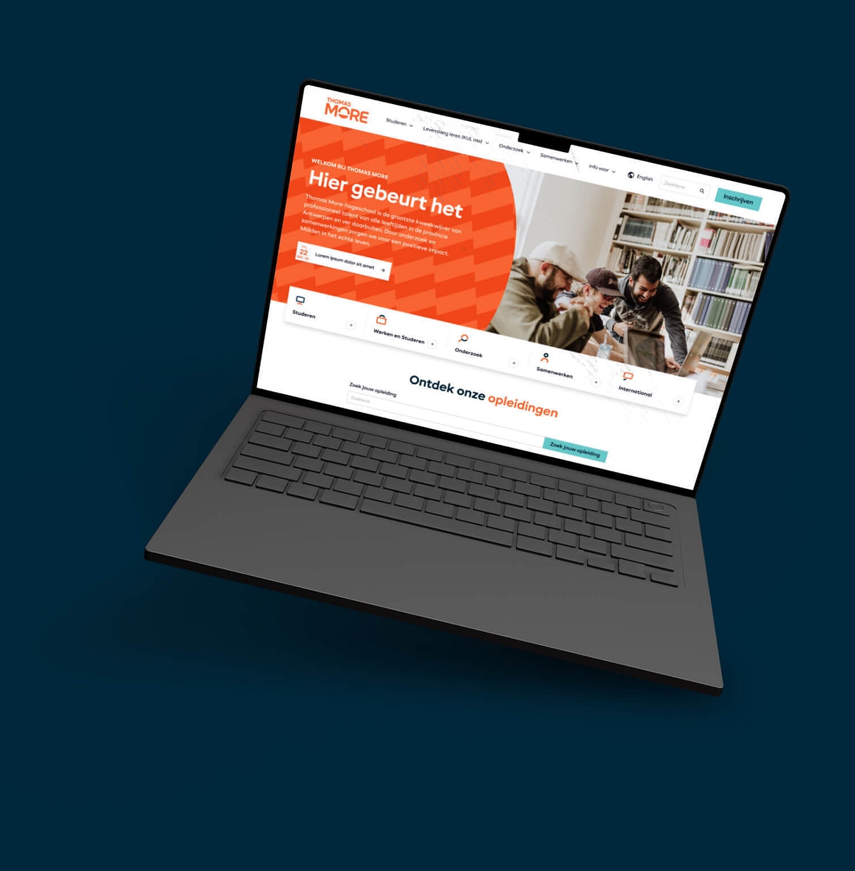
Thomas More asked us to redesign its website, boosting user-friendliness and discoverability. We set to work optimising pages through click testing and co-creation workshops, and we also built specialised websites for research topics featuring easy-to-understand animated content.
Gallery
Tailoring the user experience for a diverse range of audiences
First, we conducted a thorough audience analysis. We needed to determine who was coming to the website and what they were looking for. For example, potential students usually wanted to explore courses, whereas international attendees often looked for visa guidance. This analysis was vital to ensuring we met each visitor’s unique needs.
We used the insights we gained from this analysis to create "user journeys"—step-by-step guides showing each user group’s decision points, information needs, and@ how they use the website.
Mapping these journeys helped us streamline the user experience, tailoring the website's content and design for each group.
Scroll gallery


From assumption to assurance: user testing Thomas More’s digital experience
We knew in theory what each user group needed. However, this wasn’t enough. We needed to validate our assumptions to ensure we were on the right path.
So, we rolled up our sleeves and began testing. First, we tested basic wireframes to ensure the site's structure and menus made sense to users. This early feedback was critical—it allowed us to tweak and refine our design before diving into the more advanced stages of development.
We also ran click tests to understand how users navigated through the newly designed site. These tests involved observing users’ interactions with the website's menus and naming scheme.
By closely watching where people clicked, we gained deep insights into how users perceived the website’s design, which helped us perfect the menu names and the site’s overall flow. The result? A browsing experience that felt natural and intuitive.
Gallery
The final step: building the new website
Creating wireframes was pivotal, providing the blueprint for the website's layout and functionality. We then developed visual design elements for the aesthetics and user interface, which we stored in a design library. This digital toolkit kept our design consistent and made the development process more efficient.
We didn't go it alone, though. We teamed up with Anvil, a specialised technical partner, to convert our vision into reality. This partnership combined our design expertise with Anvil's tech skills, culminating in a user-friendly, beautiful, and efficient website that meets the needs of all Thomas More University's students.
Gallery
Don't take our word for it
"Leap Forward made an impact by making it clear from the start that they can empathise with our world. I felt that they genuinely wanted to understand and think along with us, and could guarantee a customised approach. That was an incredible advantage which immediately built trust and gave us confidence in their work"

Aagje D'Helft
Digital strategist at Thomas More


