Building a great digital experience across multiple brands
Roularta

Building a great digital experience across multiple brands

Roularta
Context
Roularta reached out to us, needing help to streamline users’ reading experiences and future-proof their business model. Through design and strategy workshops, and through significant stakeholder management, we managed to get all brands on track towards a singular goal: one design system for all digital reading experiences. We designed and developed a digital framework for all new Roularta brand websites.
Gallery
Future-proofing a business model
Roularta is the parent company for a large array of magazines and newspapers, both print and digital. They wanted to analyse their digital reading experiences and apply that knowledge to a new business model, encouraging cross brand reading and ultimately introducing a new family subscription service. We worked together with Roularta to turn their strategic ideas into a user-friendly digital experience, balancing and aligning gains for their users with Roularta’s business needs.
Gallery
Stakeholder management to ensure a uniform user experience
We set off strongly by having a One-strategy workshop with all stakeholders. We set the goal to create One app and One web platform to create a similar user experience across all brands. Working with such a diverse set of brands, who worried about losing their brand identity to an overarching digital platform, stakeholder management was key to this part of the process. We made them a promise: no concessions to their unique brand identities would be made.
Scroll gallery


Keeping brand identity alive in a one design system approach
Since we wanted to progress all websites onto one design system, we designed a uniform but flexible grid that is highly adaptable to the needs of the different brands and their readers.
We created a mix of collectively useable components and brand-specific components. This resulted in a giant component library that offers brands flexibility and the opportunity to express their identities, while making maintenance behind the scenes easier. Brands can choose between multiple navigation structures & set-ups, and retain some freedom in arranging components throughout the website.
Fast-paced user testing
We tested the waters for a concept where all of Roularta’s magazines would be digitally accessible with one subscription. The concept was named ‘Mijnmagazines’ (which translates to My Magazines) and we launched a smoke screen test to discover how the public would react. We built a simple landing page offering the new family memberships and all of Roularta’s titles in one place.
Roularta gained a lot of insights on user behaviour from this quick test: How do people react to having digital access to 20 or 30 titles? Will they read more? Do they share their account with others? This might be the most important take-away of the whole project: you don't need to build a perfectly finished product to test new concepts & ideas on a large scale. Through the use of a Minimum Viable Product, we gathered a lot of valuable information very quickly, without spending too much resources.
Mijn Magazines
An app in development, where all newspapers & magazines are accessible. Depending on where you download the app from, a personalised brand layer is added.

Mijn Magazines
An app in development, where all newspapers & magazines are accessible. Depending on where you download the app from, a personalised brand layer is added.
Text block
We picked up a similar fast pace for the overall design process. Every two sprints we organised a full day of user testing to gather feedback on our designs, the reading experience and the business model concepts. By alternating the design process with user testing, we were able to gain fast insights in how our work would be received and to find opportunities for improvement.
Launching the first brand websites
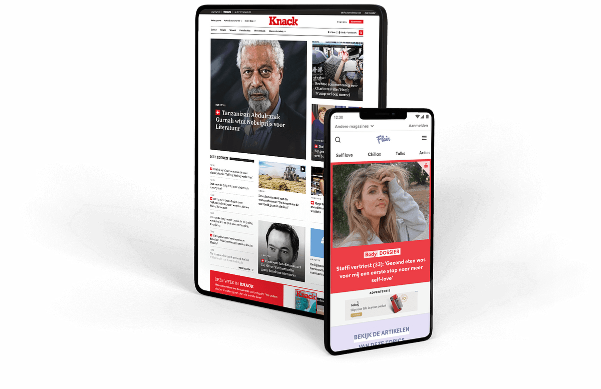
A key moment in this project was the go-live of our first two brand websites, Flair and Knack. Built on the same design system, but distinctly different in look and feel. These first two websites set the standard for all the others.
Gradually, Roularta is building and rolling out the remaining brand websites. As their design partner, we continue to support them by periodically testing the usage of new functionalities, and setting up user tests to gather data & insights on the Mijnmagazines app.
Knack.be
Knack.be is one of the first Roularta websites to go live. Knack’s recognisable brand identity shines through, made possible by our solid design system.

Knack.be
Knack.be is one of the first Roularta websites to go live. Knack’s recognisable brand identity shines through, made possible by our solid design system.
Don't take our word for it.
"This one system approach streamlined our work behind the scenes, making it easier to manage so many different websites."

Stefan Seghers
Chief Digital Officer


