From startup to scaleup: growing together with Henchman
Henchman

From startup to scaleup: growing together with Henchman

Henchman
Context
Henchman is a SaaS legaltech solution that automates low-value and repetitive tasks in the contract drafting and negotiating workflow.
Henchman has recently been sold to LexisNexis for €160 million. However, a few years ago, it was just another startup with a small team but big ambitions.
Back in 2021, its founders reached out as they needed help building Henchman’s first website. 3 years, 2 websites, and 1 rebrand later, we’re proud to see Henchman flourishing as one of the hottest AI scale-ups in the market.
Gallery
Humble beginnings, high ambitions
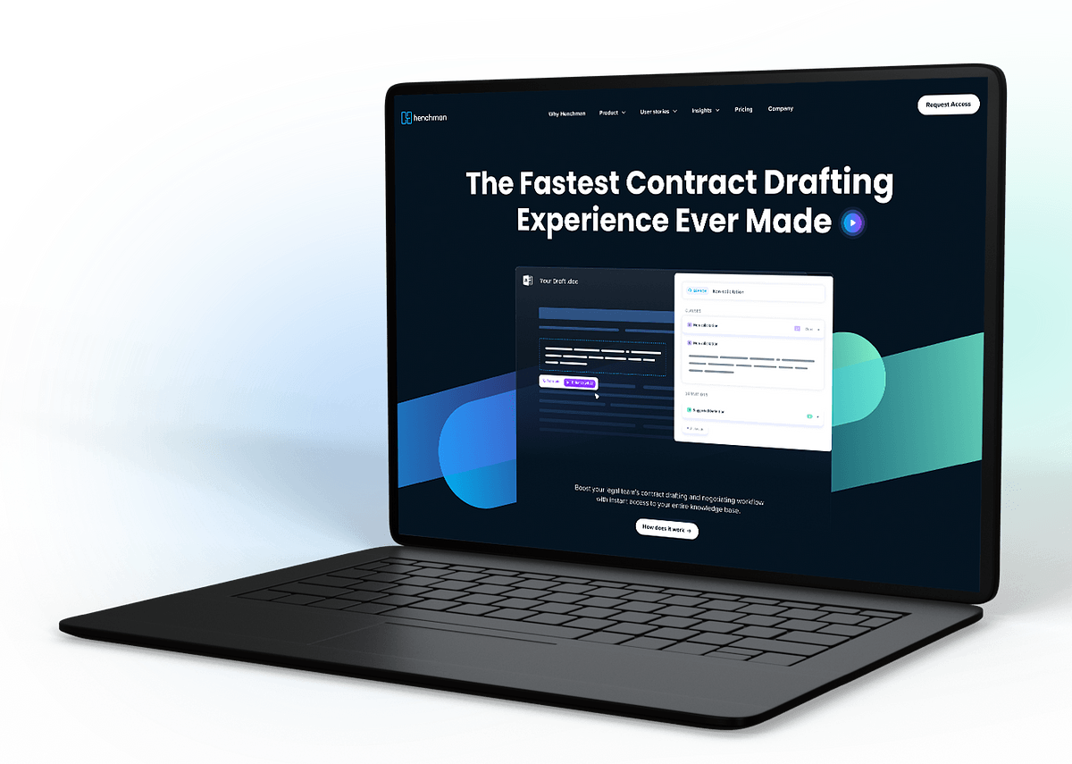
Looking to bring their vision to life, Henchman collaborated with Leap Forward to design and launch its new website. The founders wanted to introduce their concept to the market and provide a platform for refining their messaging further down the line.
However, as with all early-stage startups, the budget was tight. This meant that we had to think creatively when building Henchman’s foundations. We worked closely with their team to build a flexible website architecture that allowed them to stick to their budget for now, but could scale up in the future.
Our adaptable foundation gave Henchman the freedom to experiment with different positioning approaches, quickly create new landing pages, and progressively zero in on the perfect product-market fit.

Developing a mature brand identity
After raising an impressive $7 million in its Series A funding round, Henchman was ready to take its branding and communication to the next level.
The first order of business was to evolve Henchman’s brand, which already had a solid base, and develop this into a mature brand identity.
Our goal was to position Henchman as a serious player in the legaltech field. We needed to create a brand that would communicate confidently with its global audience.
Gallery
Showing the potential through simple visuals
Selling SaaS is hard, especially if you’re selling a niche product. The tool might look simple—but user-friendly interfaces like Henchman’s hide a ton of complexity under the hood.
We needed to strike a balance between showcasing Henchman’s innovative capabilities without overwhelming new visitors. So, we decided to add subtle visuals and animations throughout the website. This demystifies the product while ensuring it still looks impressive.
Gallery
A new website to fuel global growth
Henchman had significantly refined its vision and value proposition in the year since we’d created the first version of its website. So, our next step was to update the website accordingly by redesigning its structure and weaving in a consistent, well-thought-out narrative throughout.
By this time, we’d almost become experts in legaltech ourselves. Our extended partnership meant that we had enough knowledge of the company, its customers, and the sector to challenge Henchman’s ideas and suggest alternative routes forward.
We collaborated closely with Henchman’s team to create the best possible brand narrative. Then, we translated this into an extensive collection of website components, giving Henchman the freedom to bring its story to life for a global audience.


