Organising a hackathon for accessibility
Every now and then, we like to challenge ourselves, the team and our company for a good cause. Just like last Christmas a number of colleagues teamed up for Oxfam Pakt uit. This time, we wanted to put the focus on accessibility and accessible design. And since we saw this initiative really big, we teamed up with six other design firms and hacked one day for universal design.
The importance of accessible design
Accessible design is a design process in which the needs of people with disabilities are specifically considered. Accessibility sometimes refers to the characteristic that products, services, and facilities can be independently used by people with a variety of disabilities. We believe that accessibility is not a feature, but a mindset. Next to the usability and graphic design of a solution, also the accessibility should be taken into account. This in order to create products or solutions that are accessible for everyone.
Our colleagues Stina and Julie wanted to create more awareness about accessible design and decided to to bring together 7 design firms for this good cause. Our Leap Forward companies Little Miss Robot, Knight Moves, Once were joined by our befriended design studios Monkeyshot, Catcoon and Eleven Ways to organize this first edition of the Accessibility Hackathon.
One day, six challenges, 55 designers
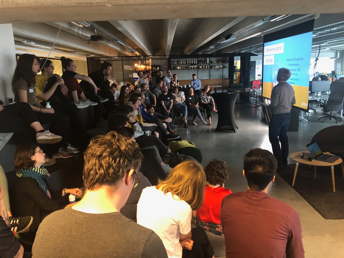
Friday the 7th of June was D-day. We started the day with welcoming our accessibility experts and a lovely breakfast. Then it was time for our expert talks. Our first speaker was Bart Vermandere, accessibility expert for Stad Gent, who showed us how their team goes on the field to check if new buildings, event sites, ... are adjusted for everybody. Our second speaker was Roel Van Gils, accessibility nerd at Eleven Ways, who gave a powerful talk about accessibility in a digital atmosphere.
Then our partners from Stad Gent, Digipolis Gent and Jabbla presented six challenges. From helping people with autism spectrum disorder with their daily routines to making musea more accessible for blind and visually impaired people, every team of designers picked a challenge. Then it was time to get to know the accessibility experts, people from the sounding board group of Stad Gent and their network. We learned all about their daily lives, their struggles and soon found a solution that might help them out.
After lunch we started prototyping and building our concepts. And then came the most important part of the day: testing and iterating. We asked our experts what they thought of the solutions, and how we could even make them better. We ended the day with pitching all concepts, drinks and Spitburgers (=local Ghent delicacy).
Many learnings of the day
Although we're working in a very customer centric way daily, we learned a lot by organizing and participating in this hackathon.
1/ User research is everything
As stated above, we're working with customers and their feedback day in day out. We're believers of the impact of user research on the success of a product, service or experience. But working with these experts in accessibility was a real confrontation in how oblivious we can be when it comes to accessibility. This can be shown in both offline and online environments. Think about lack of contrast on websites, shop signs blocking the footpath, ...
2/ Every constraint is unique
Just like every person is unique, every disability is as well. Every person experiences his or her disability in a different way. Two people with dyslexia will mix up different letters, two people with ASD (autism spectrum disorder) will manage their daily routines in a different way. But also two blind people will grow a different other sense better. Where the one will have a better sense of smell, the other might own a better sense of touch. So sometimes it's better to put the focus not on the limitation, but on the other senses of the user. This makes the challenge for designers even bigger to design in a very universal way.
3/ Accessible design is not a feature
It's a mindset! As designers we're focused on the usability and the design. But we should also convince our clients that the accessibility of their products or services should be top-of-mind. And sometimes accessibility might make the product less appealing. It's all about finding the perfect balance.
